Interiors · Colour
Colour Above Eye Level
Most people paint the wall they look at and leave the ceiling white. Reverse it, and rooms you thought were finished start behaving differently.

There is a habit so universal we have stopped noticing it. Walls get colour, woodwork gets a shade of white, and ceilings get whatever brilliant white was on the shelf. The result, repeated in millions of rooms, is a bright lid over everything, bouncing cool light down onto the top of your head.
What a white ceiling actually does
A brilliant white ceiling reflects around 85 per cent of the light that hits it, most of which arrives from windows and lamps at a low angle. That light comes down cool and flat, flattens shadows on faces, raises the apparent brightness of the whole room and, in a space with any height, makes the ceiling read as a separate element hovering above the walls.
In a dark northern flat, that is exactly what you want. In a bright climate, in a room with generous glazing, it is the reason a beautiful space can still feel like a clinic.
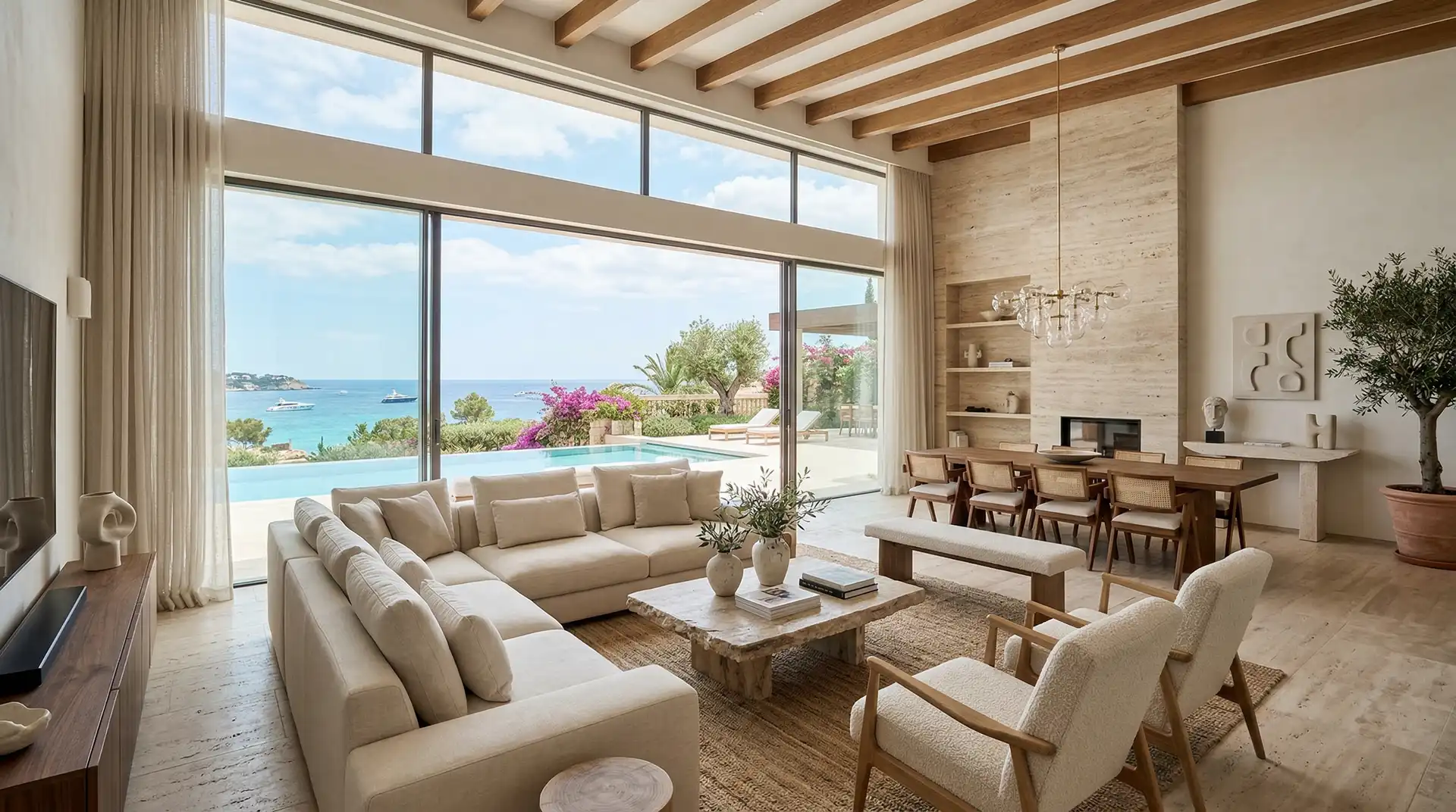
The move: tint it
Take your wall colour and mix it into the ceiling paint, roughly one part to four. You get a ceiling perceptibly warmer than the walls but not identifiably coloured. The corner where wall meets ceiling softens. The room reads as a single volume rather than a box with a lid.
Push further in rooms where you want intimacy: dining rooms, snugs, bedrooms, corridors. A ceiling the same value as the walls in a small room makes it feel like a considered space rather than a leftover one. A ceiling darker than the walls makes it feel lower, which in a room with 3 metres of height is a gift rather than a loss.
Nobody ever walked into a room and said the ceiling is too warm. They just say it feels good in here.
Rasmus Kjeld, colour consultant
The fifth wall in a room with a view
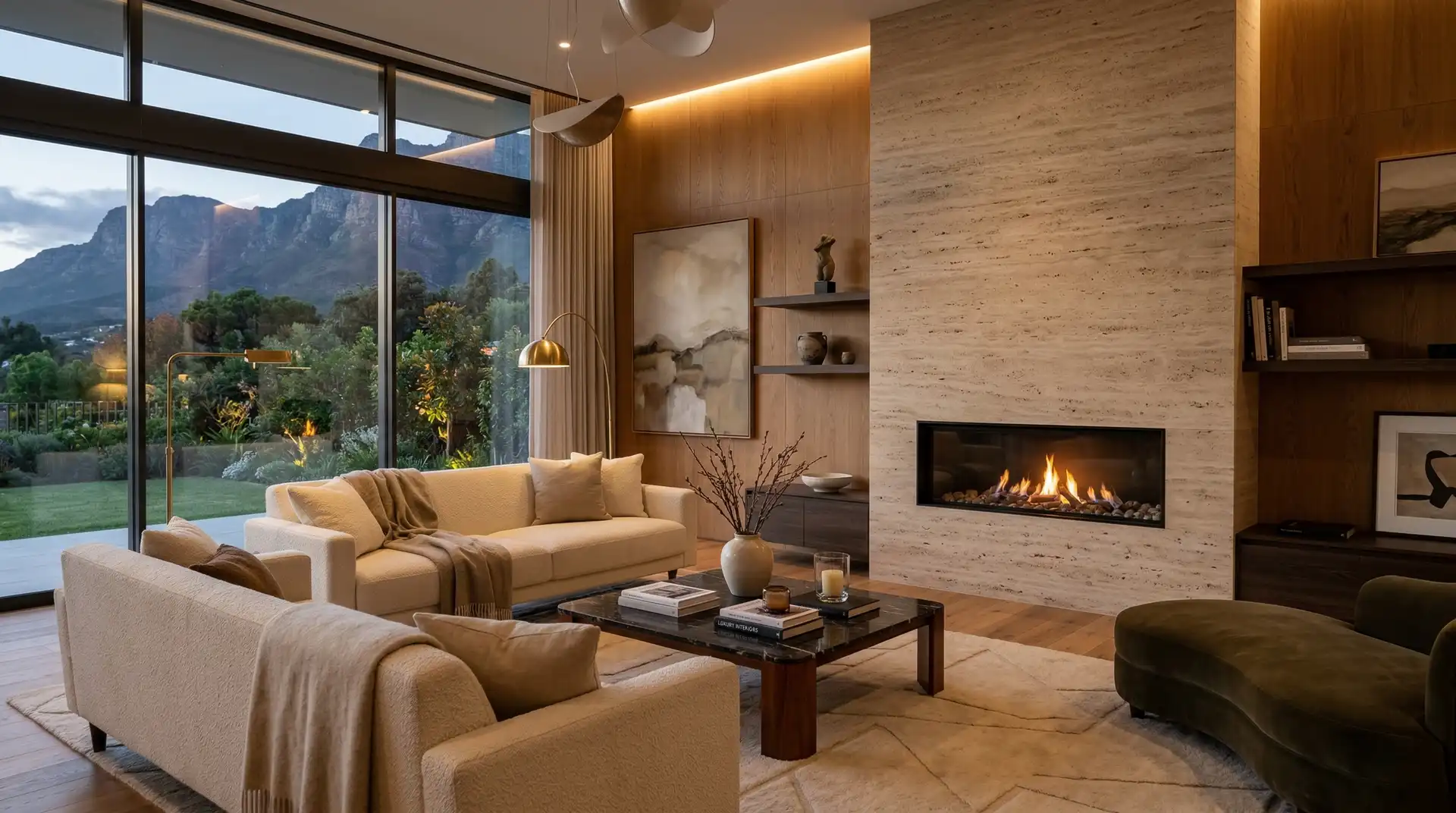
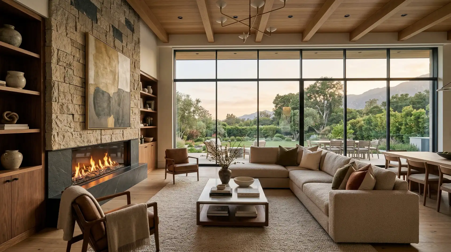
In a house facing water, the ceiling near the glass picks up reflected light off the surface and moves all day. A slightly warm, slightly matt ceiling registers that movement. A brilliant white one obliterates it, because it is already at maximum brightness and has nowhere to go.
This is why timber ceilings feel so good in coastal houses: not because timber is warm in a decorating sense, but because a mid-value surface has range.
Woodwork, while we are here
The second habit worth breaking: painting skirtings, architraves and doors a different white from the walls. It draws a diagram of the room in bright lines and makes every proportion look smaller.
Paint them the same colour as the wall, in a different sheen if you want the definition. The room becomes calmer immediately and the eye stops counting edges.
Testing it without repainting three times
Colour behaves differently at scale, at height and under your own light, which is why the sample card is worse than useless.
The method that works costs an afternoon. Paint two A2 sheets of primed card with each candidate. Tack one to the ceiling and one to the wall below it. Look at both at three times of day, including after dark with the lamps you actually own. Then move the cards to the opposite side of the room and look again.
Nine times out of ten the winner is the one that seemed slightly too warm and slightly too dark at midday, because ceilings read paler than a sample and rooms are used most in the evening.
Sheen matters as much as colour
Two ceilings in identical colour can look completely different depending on finish. A dead matt ceiling absorbs light and disappears, which is what you want in a room with height and generous glazing. A slight sheen bounces light back and makes a low ceiling feel higher, at the price of showing every roller mark and every ripple in the plasterboard.
The compromise for most houses is a fully matt ceiling, walls in a matt with a little more scrub resistance, and woodwork in eggshell rather than gloss. That gives you three surfaces reading as one colour with three different depths, which is the effect people describe as expensive without being able to say why.
One caution
This is not an argument for dark rooms. It is an argument for range. A room where the brightest surface is a wall lit by the window, and the ceiling sits half a step behind, has depth. A room where every surface is at maximum value has none, and every object in it has to work twice as hard to be seen.