Interiors · Kitchen
Kitchens That Stopped Shouting
The island grew, the handles vanished, the appliances multiplied. The best new kitchens are quietly going the other way.
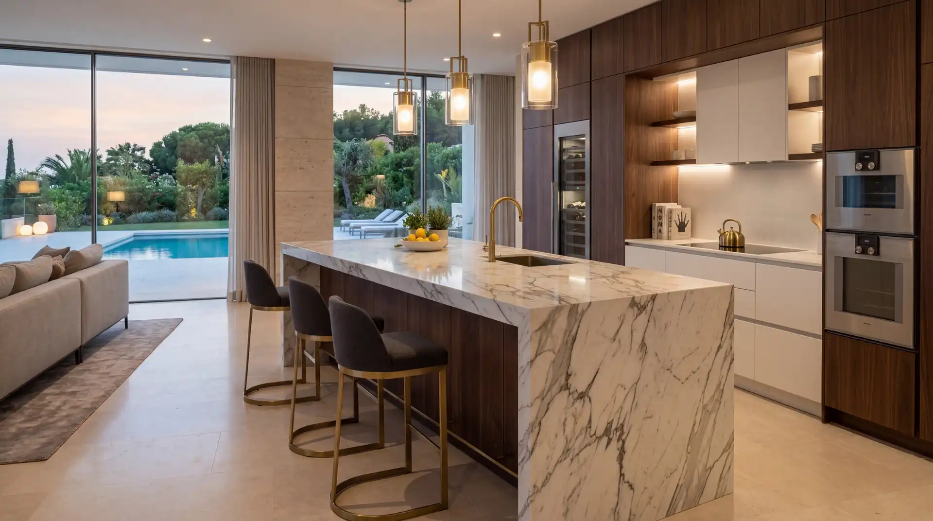

For twenty years the kitchen has been the room where houses show off. It is the most expensive room per square metre, the most photographed and, by a wide margin, the most over-specified. Two thirds of what is installed in a premium kitchen is used less than once a month.
The correction now underway is not minimalism. It is editing.
The island got too big
An island beyond about 2.8 metres long stops being a workspace and becomes a table you cannot sit at properly. Reaching across a 1.2 metre deep island to wipe the far edge is genuinely difficult, and everybody who owns one knows it.
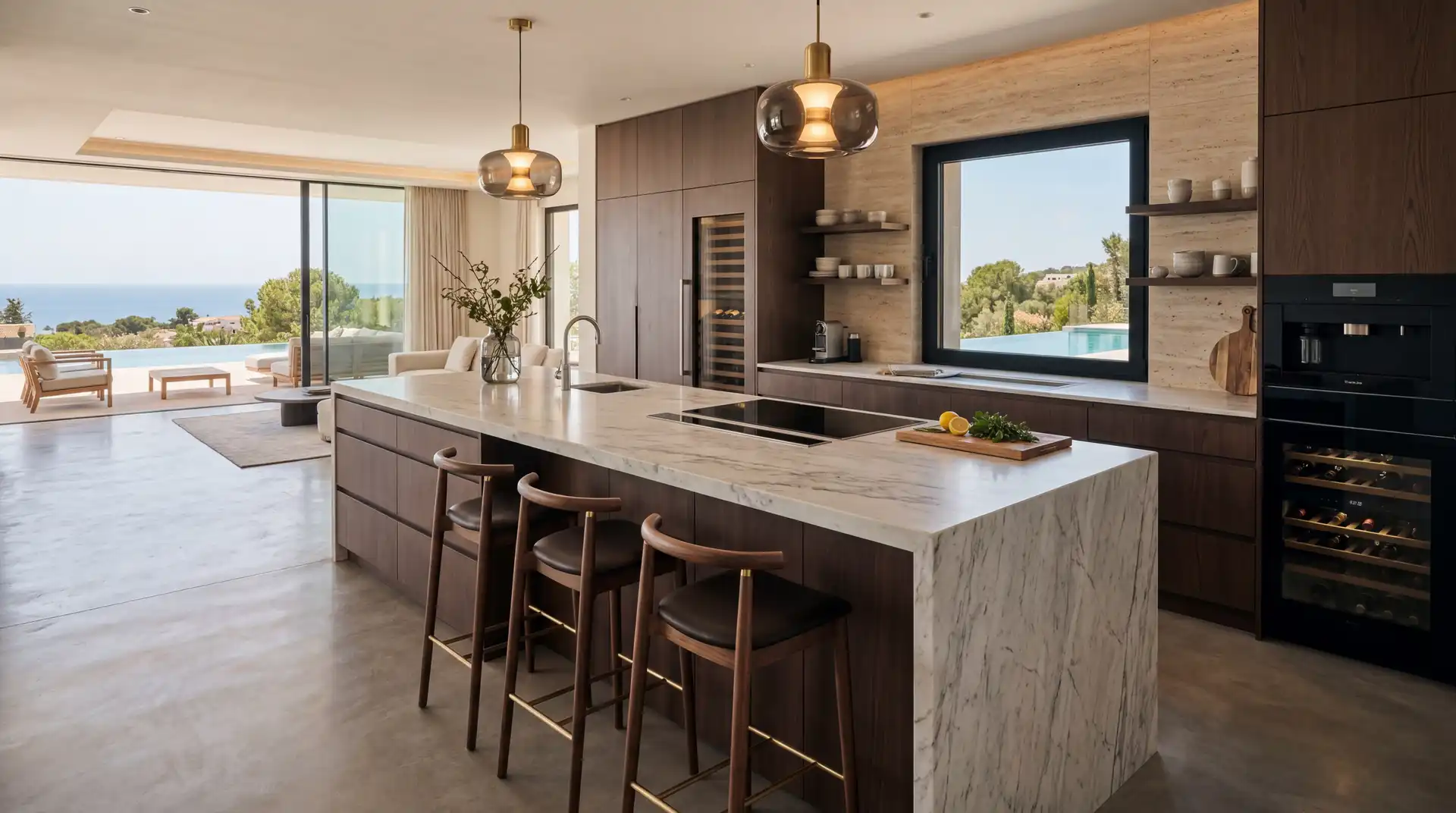
The proportions that work: 2.2 to 2.8 metres long, 0.9 to 1.1 metres deep, with 1 metre of clearance on the working side and 1.2 metres where stools go. If you want more surface, add a second, lower element rather than inflating the first.
The handleless problem
Push-to-open drawers and routed grip rails made kitchens look like furniture, which was the point. They also removed the one thing that tells you, without thinking, where a cabinet opens and how heavy it is.
Handles are coming back, and the ones that work are not decorative. A solid bar you can hook a finger under when your hands are wet, in a material that improves with grease and polishing: bronze, brass, oiled oak, blackened steel. Bad handles are a style. Good handles are a tool.
A kitchen is judged in the twenty minutes before dinner, with wet hands and something burning. Everything else is showroom.
Cecilia Moor, chef and kitchen designer
Two zones, not five
Manufacturers sell zoning as a system with five categories. In practice there are two: the wet zone, where the sink, the bin and the dishwasher form a tight triangle, and the hot zone, where the hob, the surface beside it and the oven do the same.
Keep them apart, keep each one within a single stride, and put nothing decorative between them. The rest of the kitchen is storage, and storage can go anywhere, including out of the room.
Materials that age rather than wear
Stainless steel scratches into a patina and is indifferent to heat. End-grain timber marks and can be sanded flat in an afternoon. Honed stone stains slightly and looks better for it. Sintered stone resists everything and stays exactly as new, which sounds ideal until you notice that a surface which cannot age simply looks newer than everything else in the room, forever.
The kitchens people love at fifteen years old are made of things that record use. The ones that look tired are made of things that were trying not to.
Light, which nobody plans until it is too late
Kitchen lighting fails in a specific and predictable way: a grid of downlights in the ceiling, which puts every cook in their own shadow, and a pendant over the island chosen for looks and hung at the wrong height.
The arrangement that works uses three sources. Light under the wall units or the shelf, aimed at the worktop, so the cutting board is lit from in front of you rather than from behind your head. A pendant or two over the island, hung 75 to 85 centimetres above the surface, low enough to light the food and high enough to see across. And a soft general layer, ideally indirect, that keeps the room from turning into a stage once the task lights are on.
Put all three on separate dimmers. A kitchen that can be run at ten per cent after dinner is a room. One with a single switch is a workplace.
Ventilation is a duct problem, not a hood problem
Every year people spend four figures on an extractor and connect it to a 125 millimetre duct with three bends and a flap, then wonder why the house smells of fish.
Extraction performance is decided by the duct: its diameter, its length and the number of turns. A 150 millimetre duct with two gentle bends and a short run will outperform a far more expensive hood on a strangled pipe. Recirculating filters are a compromise that removes grease and smell but not moisture, which in an open plan flat means the moisture ends up on the windows.
If you take one thing from this section: decide the route to the outside wall before you decide which appliance sits under it.
The wall of tall cupboards
If there is one plan move worth copying, it is putting all the storage on one wall, floor to ceiling, in a single quiet run, and leaving the rest of the room almost empty. Every appliance behind a door, every jar behind a door, one long surface and a table.
It is more expensive per metre and cheaper overall, because you stop buying wall units, splashbacks, open shelving and the objects to fill it. And it produces the effect every kitchen brochure promises and few kitchens deliver: a room that reads as a room, not as equipment.